Aesthetics
That's one word which is darn hard to spell. It is also one idea that Malaysian transport planners know little about.
To us, sights like these are pretty common:

Pondoks
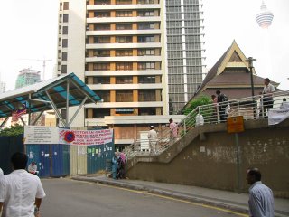
Plastic structures
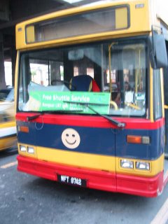
What's there to smile about?
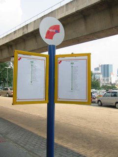
Typical tiang with accompanying A4 solutions
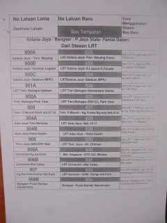
Typical A4 solution

Accompanying ugly website with scrolling text
Whereas elsewhere, there are other places which are light years ahead (although buses and trains in a lot of places can be pretty pretty dodgy and manky).
Let's explore how transport authorities around the world are working hard to ensure that public transport is not associated with UGLY.
Beautiful Subways
Below are photos of subway and metro stations from around the world.

Pictured above is the Tehran Metro. Wow. Tehran!?
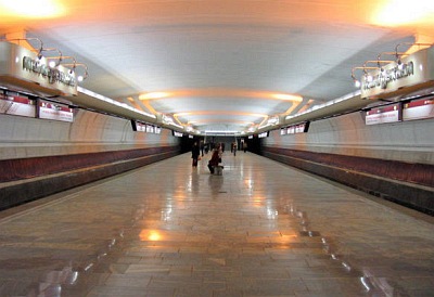
Above is Minsk. I bet you don't even know where it is.
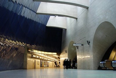
Above is Southwark, in London. It's pronounced suth erk, btw.
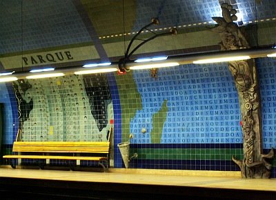
Parque station, Lisbon, Portugal.
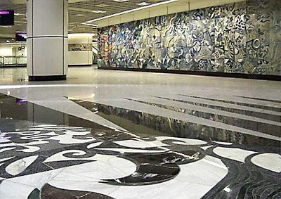
And above is Singapore, our neighbour which manages to piss of our short-sighted leaders and yet inspires the rest of us.
These photos are from Beautiful subways from around the world. No need to go to Page One at Kino KLCC to buy a 300 ringgit coffee table book.
Beautiful identity
Transport literature is also something I hold important. When I travel the world, I try to collect subway maps.
And after seeing so many subway and transport system, I still feel London's the most beautiful. (I love London, I am biased).
Look at this Tube map showing parts of London's West End.
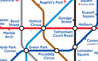
And the really elegant looking corporate logo for the Underground - the roundel:

Meanwhile, what's Rapid KL's?

A monotone rainbow.
Back to maps. Our official Rapid KL one is as follows:

Quite good actually.
But let's see how this extends to other Rapid KL literature:
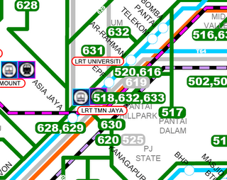
Hmmm... Well, how about London?
Below is a bus map. Here is the PDF of it.
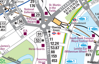
And do you remember the spider maps?
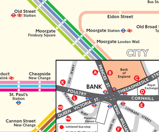
We have hope
Interestingly, the good people at Vector Designs have produced an amazing and beautiful public transport map for Kuala Lumpur City Hall.
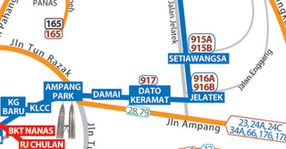
With all this redrawing of Rapid KL's bus networks, this bus map's pretty much outdated (2005). But a new one ought to be on its way. The map's tastefully done and it's so intuitive. I hope this map would become widely adopted and would be extended to the rest of the Klang Valley and Malaysia.
Sigh
Well I would give Rapid KL a benefit of the doubt. They are barely a couple years old, and trying to make things beautiful ought to be one of the last things on their mind.
But in the long run, something has to be done to come up with a tasteful, nice and consistent corporate image for all of Klang Valley's public transport (not just Rapid KL).
I'm not going to deliver a case for aesthetics. It's subjective, it can be expensive and there are no clear benefits.
(WARNING: excessive goreng-menggoreng and warped reasoning ahead)
But wouldn't it be nice to treat all this public infrastructure as not just mere functional objects? I think if we can mould an identity and image for these uber-plebian instruments, public transportation can be transformed into an institution that everyone in Klang Valley would love. And once it becomes a loved institution, riding on the LRT won't be such a torture anymore.
To us, sights like these are pretty common:

Pondoks

Plastic structures

What's there to smile about?

Typical tiang with accompanying A4 solutions

Typical A4 solution

Accompanying ugly website with scrolling text
Whereas elsewhere, there are other places which are light years ahead (although buses and trains in a lot of places can be pretty pretty dodgy and manky).
Let's explore how transport authorities around the world are working hard to ensure that public transport is not associated with UGLY.
Beautiful Subways
Below are photos of subway and metro stations from around the world.

Pictured above is the Tehran Metro. Wow. Tehran!?

Above is Minsk. I bet you don't even know where it is.

Above is Southwark, in London. It's pronounced suth erk, btw.

Parque station, Lisbon, Portugal.

And above is Singapore, our neighbour which manages to piss of our short-sighted leaders and yet inspires the rest of us.
These photos are from Beautiful subways from around the world. No need to go to Page One at Kino KLCC to buy a 300 ringgit coffee table book.
Beautiful identity
Transport literature is also something I hold important. When I travel the world, I try to collect subway maps.
And after seeing so many subway and transport system, I still feel London's the most beautiful. (I love London, I am biased).
Look at this Tube map showing parts of London's West End.

And the really elegant looking corporate logo for the Underground - the roundel:

Meanwhile, what's Rapid KL's?

A monotone rainbow.
Back to maps. Our official Rapid KL one is as follows:

Quite good actually.
But let's see how this extends to other Rapid KL literature:

Hmmm... Well, how about London?
Below is a bus map. Here is the PDF of it.

And do you remember the spider maps?

We have hope
Interestingly, the good people at Vector Designs have produced an amazing and beautiful public transport map for Kuala Lumpur City Hall.

With all this redrawing of Rapid KL's bus networks, this bus map's pretty much outdated (2005). But a new one ought to be on its way. The map's tastefully done and it's so intuitive. I hope this map would become widely adopted and would be extended to the rest of the Klang Valley and Malaysia.
Sigh
Well I would give Rapid KL a benefit of the doubt. They are barely a couple years old, and trying to make things beautiful ought to be one of the last things on their mind.
But in the long run, something has to be done to come up with a tasteful, nice and consistent corporate image for all of Klang Valley's public transport (not just Rapid KL).
I'm not going to deliver a case for aesthetics. It's subjective, it can be expensive and there are no clear benefits.
(WARNING: excessive goreng-menggoreng and warped reasoning ahead)
But wouldn't it be nice to treat all this public infrastructure as not just mere functional objects? I think if we can mould an identity and image for these uber-plebian instruments, public transportation can be transformed into an institution that everyone in Klang Valley would love. And once it becomes a loved institution, riding on the LRT won't be such a torture anymore.



4 Comments:
The ability to plan your journey before leaving your house is another perk that would make public transportation in KL a little friendlier. Apart from producing really beautiful maps, the Transport for London website is also one of the best I’ve seen (to be honest, I haven’t seen much). As a foreigner, I am able to get from one place to another without any problems only by seeking virtual help. If you’re too lazy navigating the routes yourself, you have the option of a ‘journey planner’. I hope that in the near future, we are able to produce and provide relevant guidance on how to take our public transportation without having to ask aunties or uncles who have been riding it for years.
Yeap miss prissy - the next thing I am going to blog about is their website!
I think wikipedia has better transport planning advice than Rapid's.
sigh. sigh. sigh. sigh. sigh.
If I'm not mistaken, Vector Design considered the possibility of that route planner similar to Transport for London; however it is too expensive a system to build. Plus, with the rate we are changing bus routes; it would be impossibly difficult for anyone to maintain.
remember:London is a city with more than 10 million inhabitants,while KL is just barely reaching 1.5 million soon.
In Moscow,where I study,subway trains arrive at a freq of 1 min-1.5 min (we can't even have the chance to sit down!),bcs the population is 10 mil.
compare with ours...we have to suit with our needs...if there's a huge surplus things will operate at a great loss (plus,KL ppl are not eager to use the public transport!).
don't view our transportation system SOOO NEGATIVELY.
if you keep thinking negatively and condemn the gov's plans,things won't change.
so change your mindset.be positive.
Post a Comment
<< Home